

Marketers have all heard the traditional advice for sending outbound emails: stick to Tuesday mornings, avoid Fridays, and don't even think about weekends. It sounds reasonable, but most of this guidance is just recycled best practice rather than insight tailored to your specific audience. GTM leaders don't need more generic benchmarks; they need to understand the rhythms of the people they are actually trying to reach.
In practice, when you look across SDR, AE, and executive outbound and marketing emails, the data is pretty messy. To address the ambiguity of outbound timing, we built the Send Time Optimizer, using the power of the Upside MCP to reconstruct complex email chains and unify engagement signals.
Here's how you can do it too
1. Consolidate
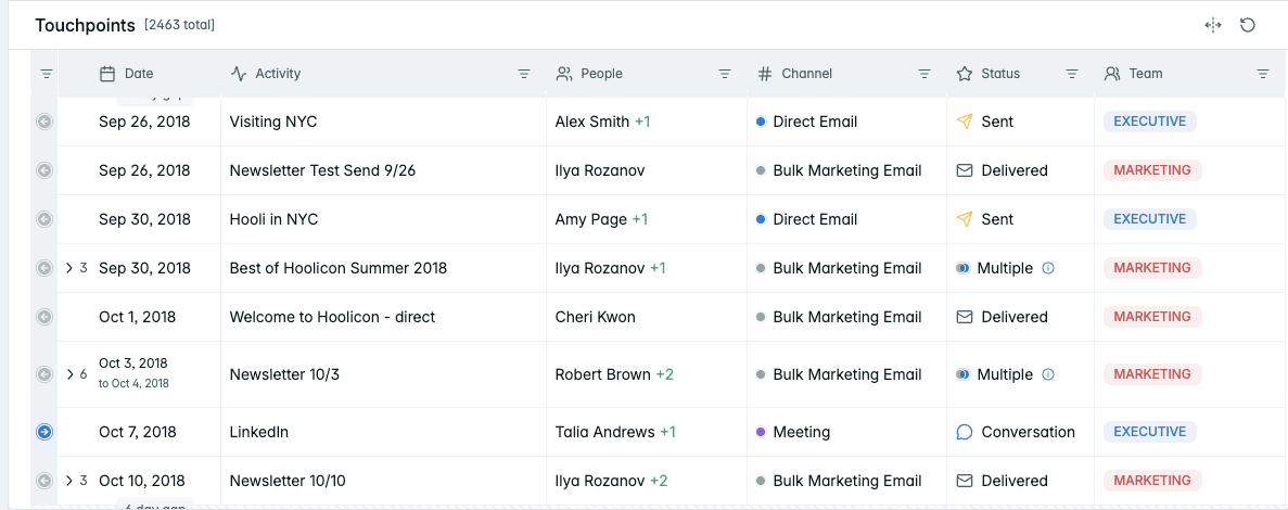
Gather all of your interactions into a single, unified view. Make sure all contacts are deduplicated and people are attributed to the correct identity. Upside users automatically have this handled for them.
2. Filter
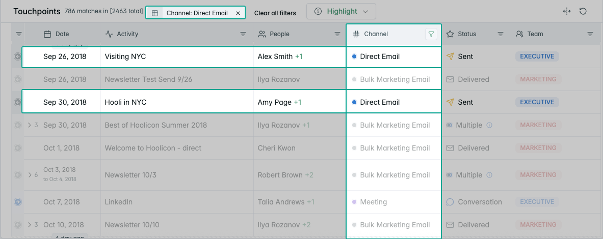
Differentiate between direct outbounding and broader marketing initiatives (such as email blasts), as each generates distinct behavioral signals. This can be done by filtering in a dashboard view or by querying your data directly with an AI agent such as Claude or Cursor.
3. Clean, audit, and normalize
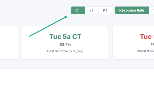
Audit the timestamps and responses attached to all emails for accuracy, so they reflect true outbound activity rather than bulk emails. Critically, add logic that addresses the friction of conflicting timezones within threads. In Upside this is already handled for you, and a quick prompt lets you toggle between timezones so you can optimize for yourself and the receiver in the final product (along with anyone else who has enterprise-level permissions to the dashboard you build).
4. Contextualize
Contextualize response rates with total volume in mind, so you are not misled by outliers in low-traffic windows. Even better if you can switch between a few options. We want as much information as possible here.
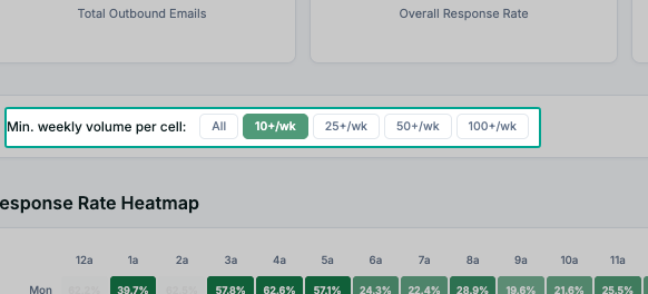
5. Visualize
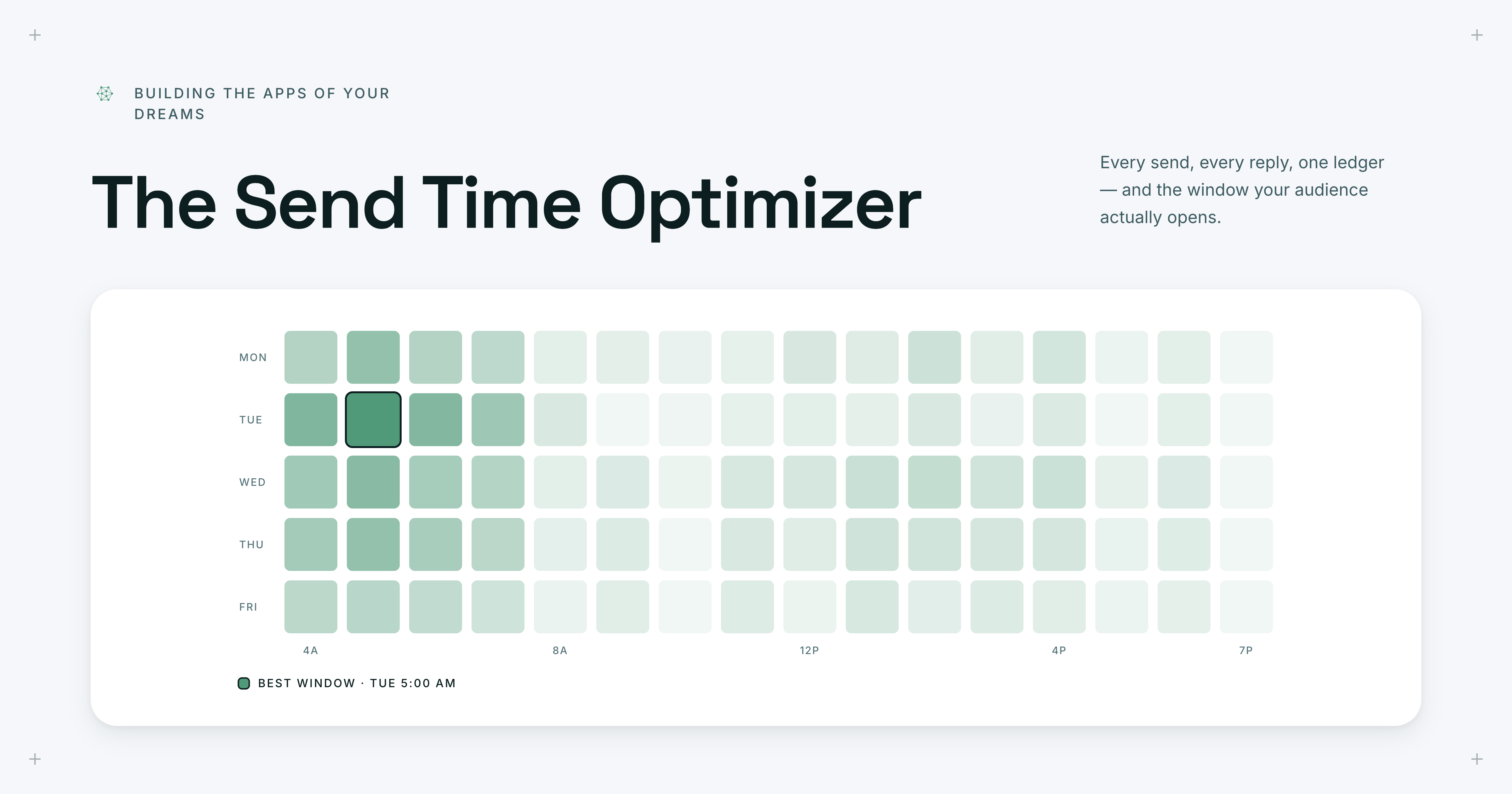
Combine all of this by leveraging an AI agent to build a visual interface that maps engagement signals like opens and clicks against timing. Here's the example we built using the Upside MCP:
Try it yourself. Copy this prompt and drop it into an AI agent connected to the Upside MCP:
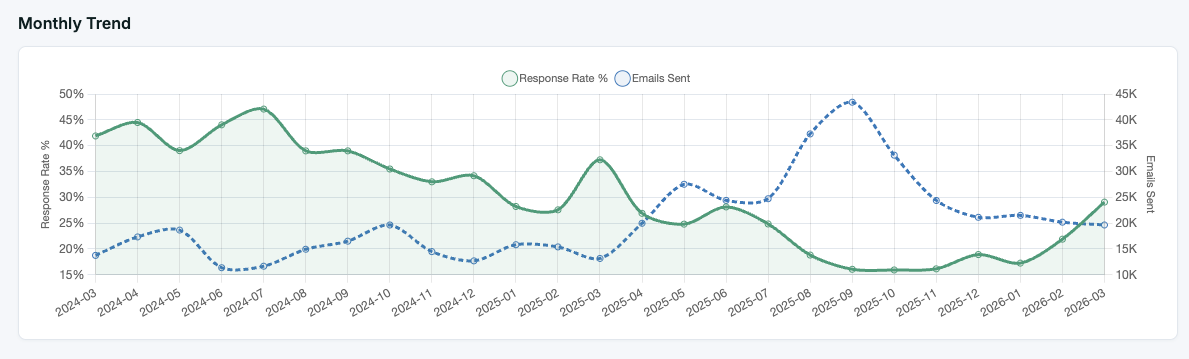
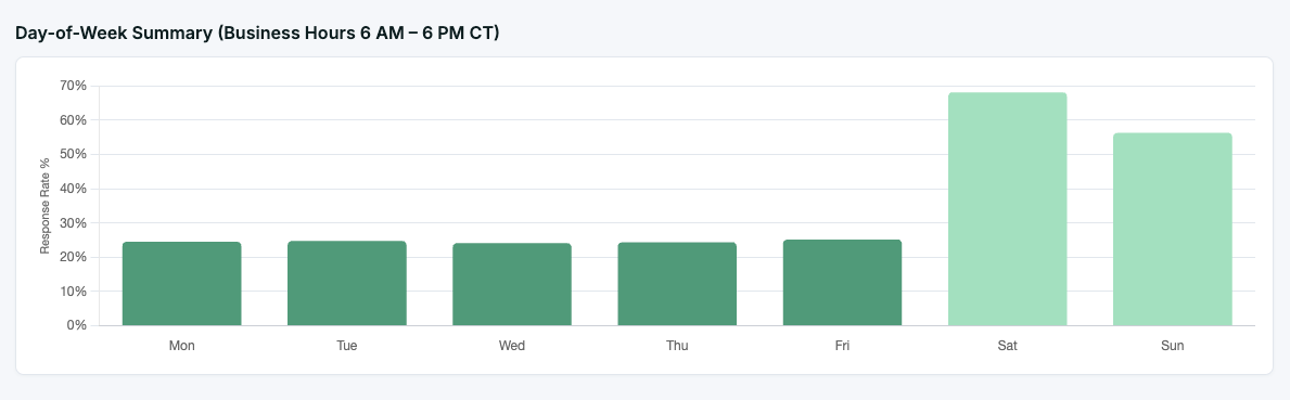
Build me a Send Time Optimizer dashboard. Pull all direct email touchpoints from the last 12 months, excluding bulk marketing sends. Normalize timestamps to the recipient's timezone. Create a heatmap showing response rates by day of week and hour of day, with a minimum volume filter to exclude low-traffic windows. Include KPI cards for overall response rate, best send window, and worst send window. Add a timezone toggle so I can switch between sender and recipient perspectives. Also include a monthly trend chart comparing response rate against email volume, a day-of-week breakdown, and a ranked list of the top best and worst send windows.Bonus
Build out additional table and graph views that visualize the data broken down further.
Common pitfalls
These are where standard analysis tends to get tripped up. A reliable dashboard will account for these inconsistencies.
- Not identifying hidden engagement and activity, which is frequently masked as simple CRM entries without context.
- Not managing time variances by directing the system to normalize data based on the recipient's specific geographic location.
- Not adding a volume filter that sets low-traffic time slots aside, so a handful of off-hours email sends don't distort the recommendations as a whole.
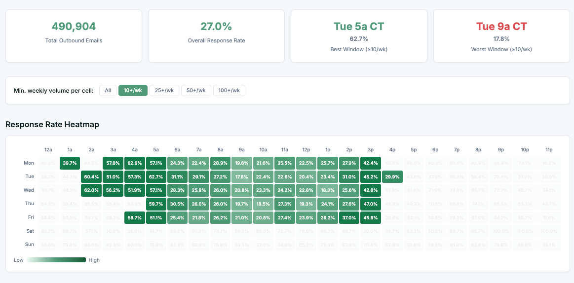
The result
When implemented correctly, the Send Time Optimizer lets teams prioritize their most important outreach during high-performance windows while shifting lower-priority tasks to "dead zones." Having this level of detail transforms send timing from a game of chance into a pillar of the outbound effort.
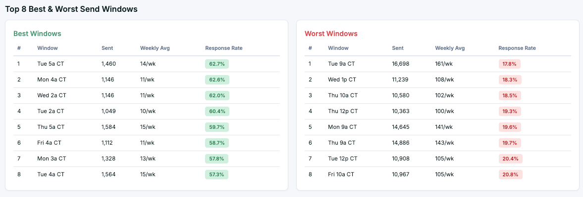
Developing this app revealed some unconventional patterns:
- The optimal send window was Tuesday at 5:00 am.
- The least effective window was Tuesday at 9:00 am.
- The overall response rate reached 27%.
We could not have surfaced these insights without building this custom dashboard using Upside.
How Upside makes this effortless
The magic of the Upside platform lies in the data foundation. We take on the work of cleaning, normalizing, and connecting your fragmented go-to-market data so you walk away with clear advantages:
- Teams spend time asking questions instead of wrestling with spreadsheets.
- Natural language prompts allow for instant generation of insights and dashboards.
- Relevant filters and logic are applied automatically based on your descriptions.
Upside represents a fundamental shift away from static reports toward a dynamic environment where insights are generated in real time.
By removing the chasm between a business question and a data-backed answer, we ensure that your outbound strategy keeps evolving alongside your audience's behavior. Your most ambitious ideas for custom applications and data tools are no longer destined to be stuck in a technical backlog; instead, they are a prompt away from becoming reality. This accessibility empowers everyone from executive leadership to frontline contributors to make data-driven decisions that compound revenue and build stronger connections with customers.