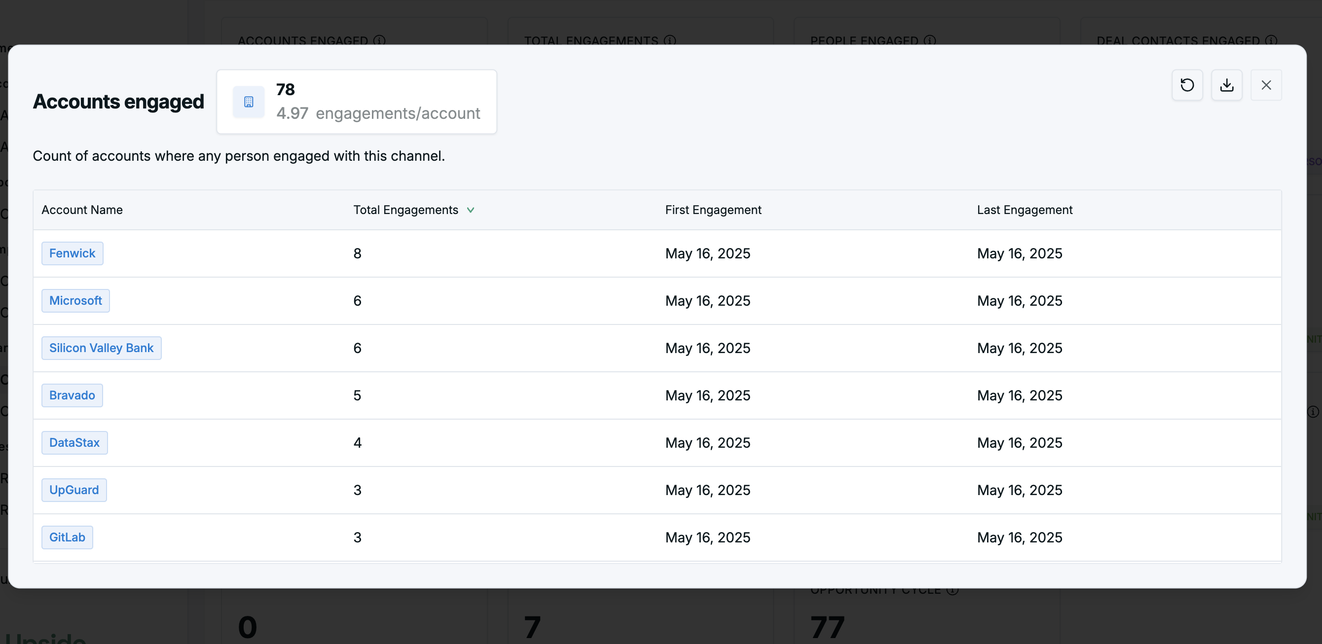
Visual overview of all account engagement.
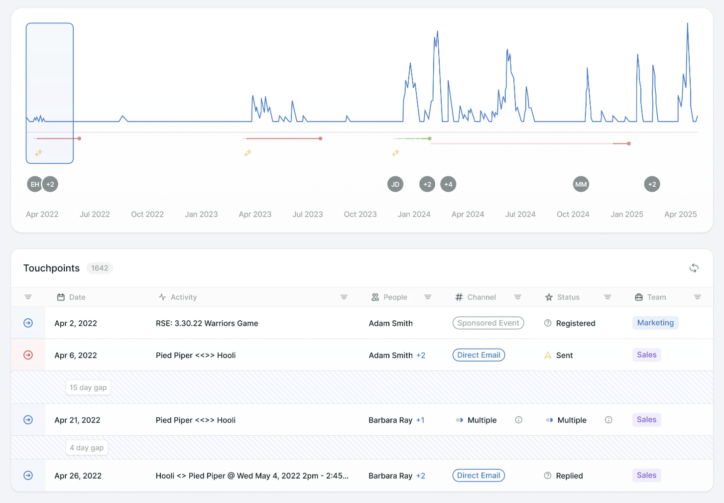
The minimap visualizes account and buying group engagement momentum over time, with peak heights indicating relative engagement volume, overlaid with opportunities and new person engagements. Users can zoom in/out for detail and click any point to view touchpoints from that period.
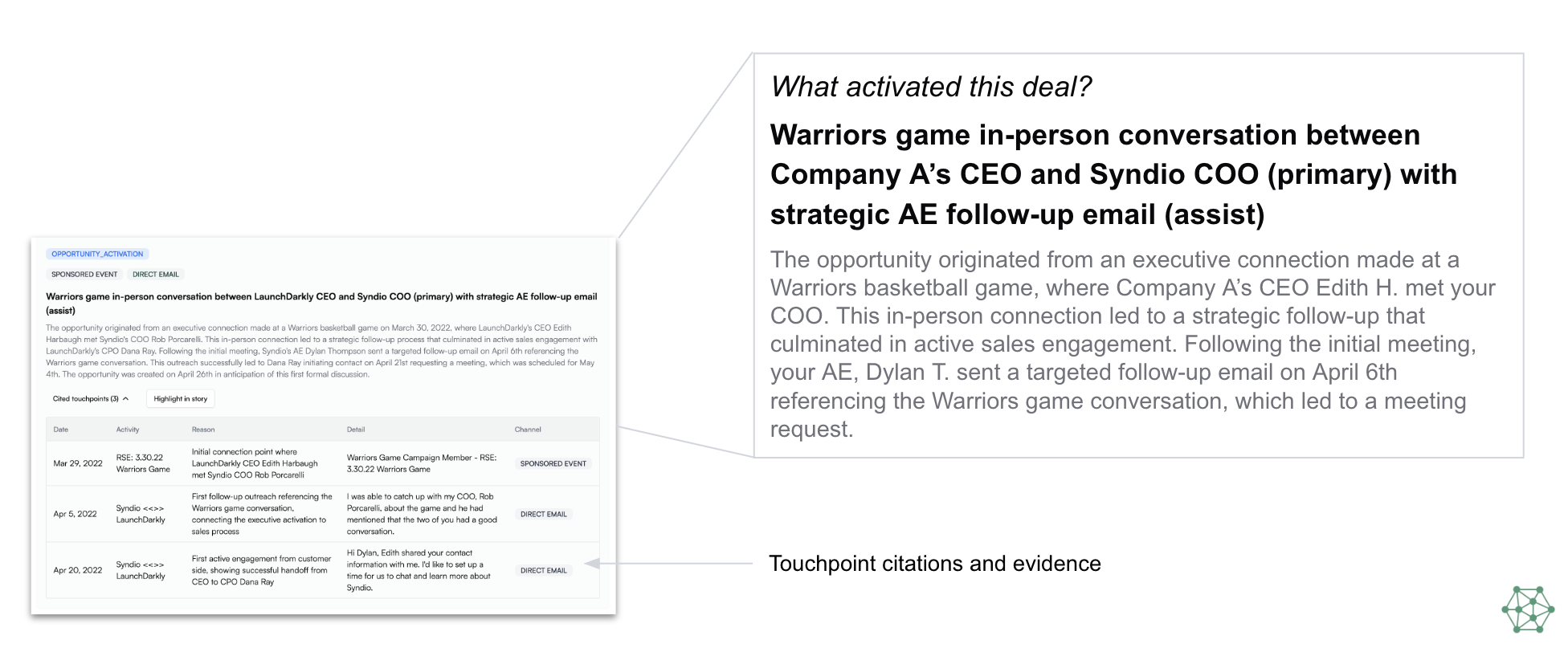
AI-driven insights to understand deal origination points.
Upside's team of AI agents crawl the data, provide opinionated insights on key factors impacting the deal, and cite the touchpoints that led them to their conclusion for accurate and actionable insights.
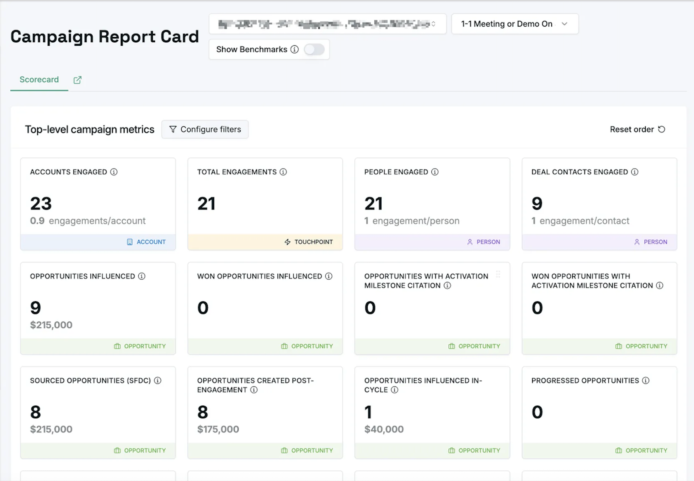
Report aggregate metrics for a single selected instance.
Traditional metrics (influence, contact sourced, opportunities progressed) and AI-derived insights (opportunity activation). Each card is clickable for deeper analysis.
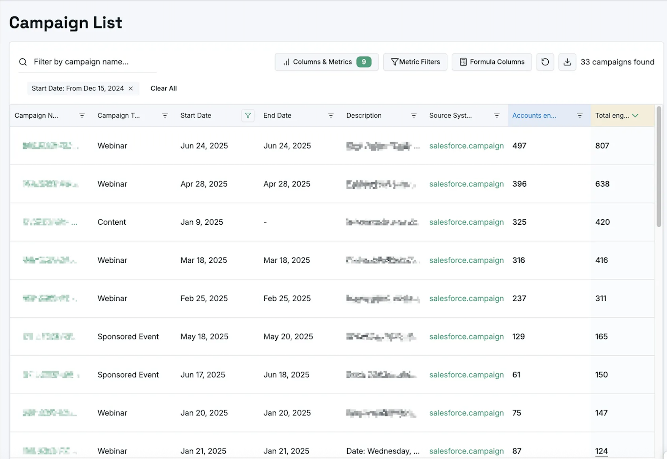
Create quick reports to compare and contrast different instances.
Table views with standard and AI-enhanced metrics, filters, formula-based columns, and Excel-like expressions for custom analysis.
Compare a campaign against a custom configurable benchmark group for performance insights.
See how a campaign stacks up vs. channel average, vs. last year, or any other custom group you define.
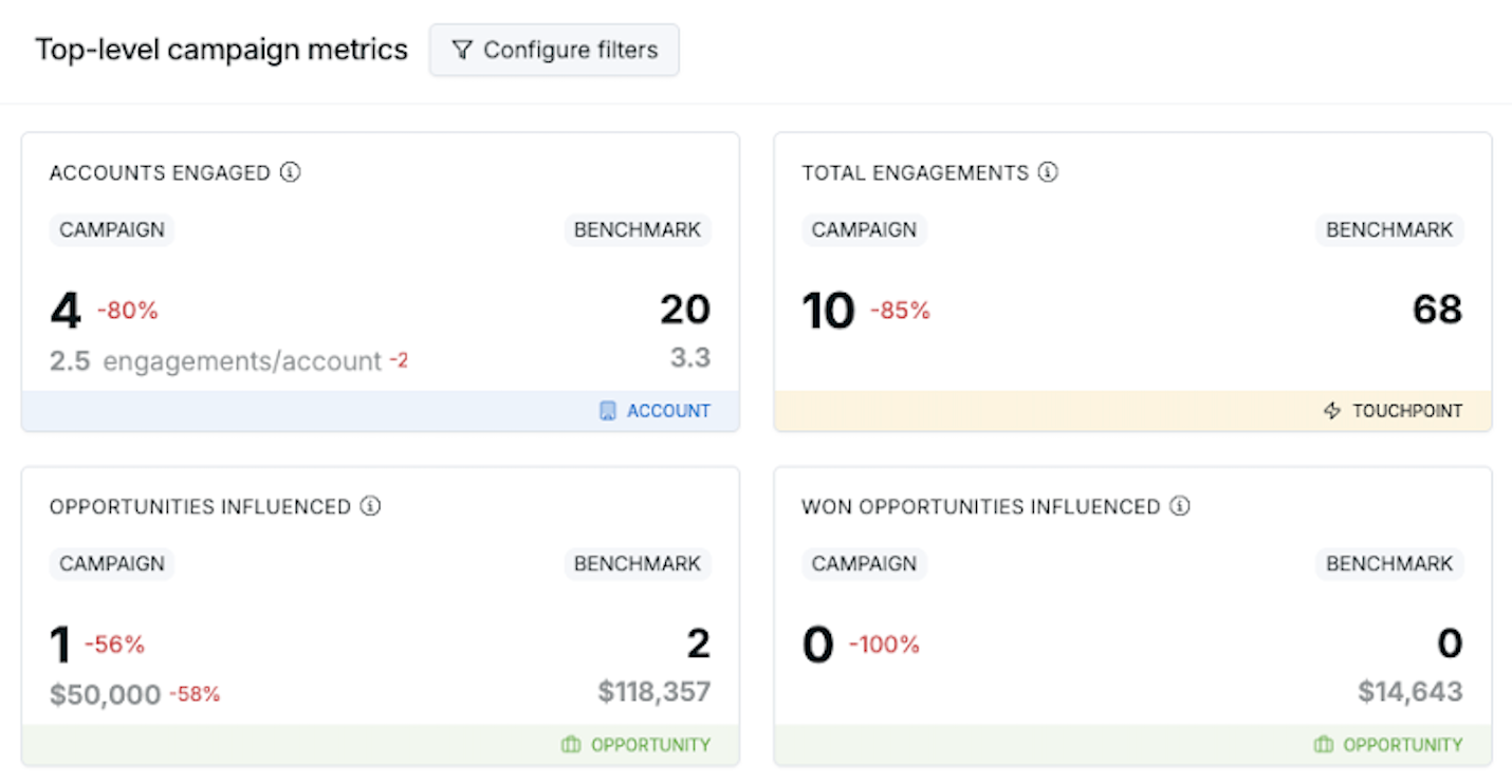
Drill down into how each metric was calculated.
Filter by date and any Salesforce field to understand the precise inputs behind every number.